Customization
Customizing your Action's theme allows you to better reflect your brand and provide visual context to your user's experience.
Overview
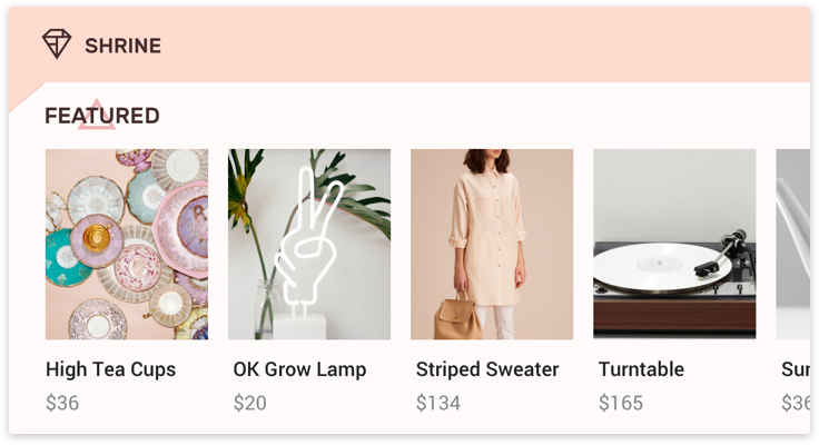
When theme customization, or theming, is used properly, it can help differentiate your Action. The choices you make when customizing the visual components of your Action (like basic cards, carousels, lists, etc.) will help you effectively convey your brand.
The Assistant's design is constantly evolving to help users wherever they are, on whichever device they choose. So we've designed the guidelines in this section to evolve along with it. Our goal is to enable you to express your company's identity in a way that 1) feels natural in the overall system interaction, 2) focuses on the biggest opportunities for brand expression, and 3) scales across all primary devices (for example, phones and smart displays) without additional work.
The default Assistant surface theme is applied to your Action visual component if you don't specify theming details. You can go to the Actions Console to customize your Action theme.
Color
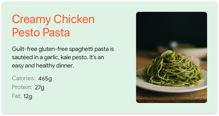
Color is a strong brand identifier. You can customize primary and background colors to represent your brand. Primary color is used to highlight important components on the visual surface, like the card title and any action buttons. This color should be the one most often associated with your brand.
Note
Secondary text color is not open for customization at this point.
Primary and background colors can work together to enhance the expression of your brand
Choosing your primary and background colors from the same color family can help make your Action a cohesive experience
Choosing a complementary color for your background can make your primary color stand out even more
To ensure the colors you choose are accessible, we do a color contrast check in the developer console to ensure sufficient color contrast ratios between the primary and background colors and between the secondary and background colors. For more guidance on choosing and coordinating primary and background colors, visit the Material Design site.
Background image
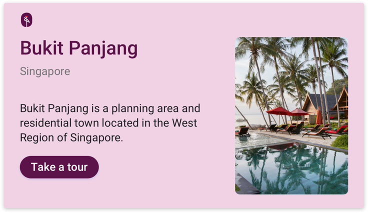
One of the most powerful ways to lend visual richness and dimension to a card is to use an image as the background instead of a solid color. Consider the following when choosing an image as the background:
Choose a background image that provides context without distracting from the conversation
Note that to ensure foreground legibility, we apply a dark protection mask on the background image. Text will automatically turn to white.
If your Action has multiple dialog turns, choose a background image that works with different dialog turns
Typography
Typography can express your brand while guiding the user's attention to the most important information. For the biggest impact, you're able to customize the largest text, like the title, on each card in your Action. In this location, an expressive typeface such as a serif font, a script-style font, or a heavier-weight font can attract attention and provide contrast to the secondary text. For general typography guidance, please refer to the Material Design Foundation.
Note
Secondary text is applied based on different Assistant surface defaults and is not open for customization at this point.
Choose a font that works well with secondary text
| Do | Don't |
|---|---|
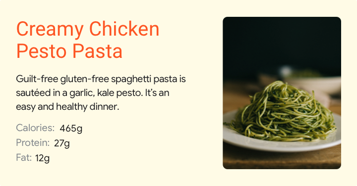 |
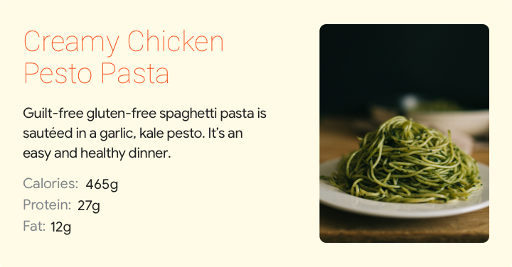 |
| With its bold typeface and bright color, this font stands out against the background and attracts attention to the card title. | Without the heavier weight, this font is hard to read and fails to draw the eye to the title before the body text. |
Shape
Image shape
In line with the components of Material Foundation, the shape of your images offers another dimension for expressiveness. Right now, you can choose between angled and curved shapes for images in visual components. Pick an image shape that's suitable to your overall brand style.
Use angled corners if your brand incorporates sharp edges and clean lines
Use curved corners if they fit your brand's overall style
For more guidance on choosing image shapes, visit the Material Design site.