Media response
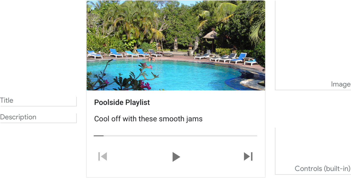
A media response is used to play and control the playback of audio content like music, news, or podcasts.
Example
Here’s an example of what a media response looks like.

Note
For code examples, see the Actions on Google developer documentation.
Requirements
This visual component currently supports customization.
| Field name | Required? | Restrictions / Customizations |
|---|---|---|
| Image | No | There are 2 image options: 1) a small square thumbnail on the right, or 2) a large image on top (which spans the full width of the card). Small
|
| Title | Yes |
|
| Description Also called body or formatted text or sub-text. |
No |
|
| Media file | Yes |
|
Interactivity
Tap card:
- Play/Pause button
- Restart button
- Forward 30 seconds button
- Back 10 seconds button
Voice/Keyboard:
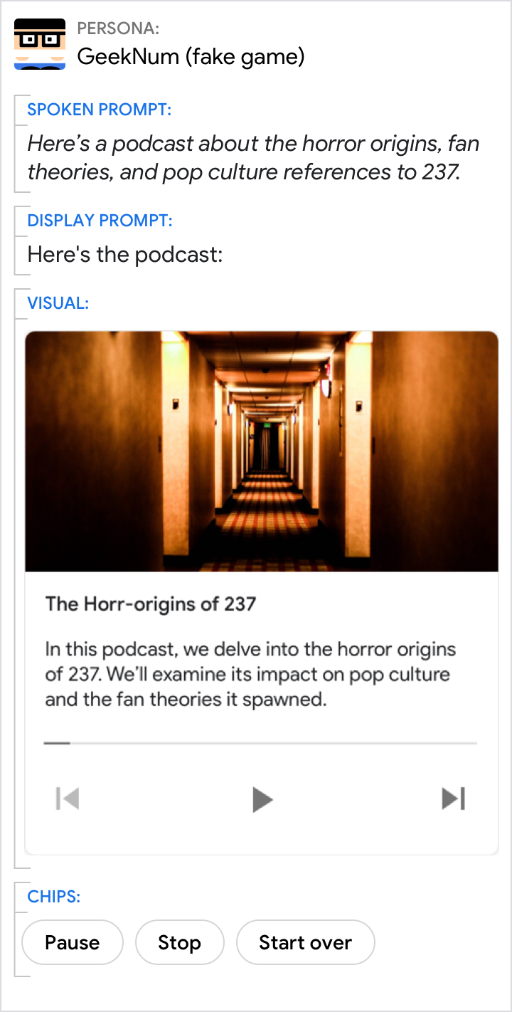
- Play
- Pause
- Stop
- Start over
Status
- Elapsed time is shown on the left side, format HH:MM:SS with the hour field dropped any time it is 0
- Total time is shown on the right side, format HH:MM:SS
- Progress bar
Guidance
The media response is used to give visibility to an audio track. For example, the track's name, length, optional associated image, and Play/Pause control. This card is used to present a single piece of audio to the user.
Best practices:
- For song playlists, the Title should be song name and Description is the artist’s name.
- Branding images should use the small image, not the large image.
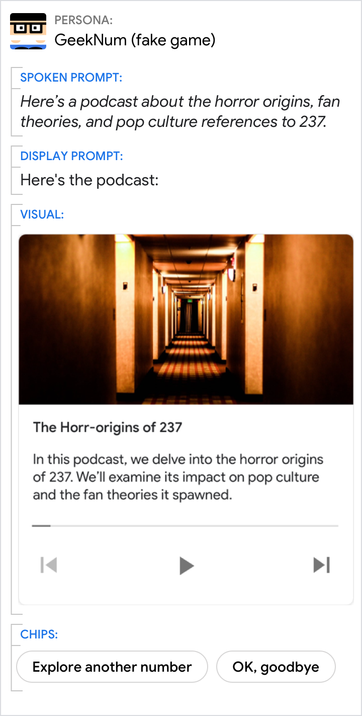
Introduce the media briefly, and let the user pivot to something else.
| Do | Don't |
|---|---|
 |
 |
| When playing audio, always include chips for the user to pivot to some other action or progress the flow. | Don’t include media controls as chips. |