Basic card
Use basic cards (also called entity cards) to display an image and text to users.
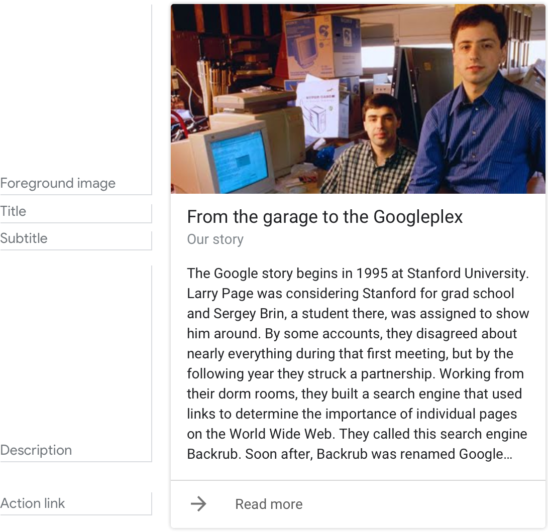
Example
Here's an example of what a basic card looks like when all required and optional fields are completed.
Note
For code examples, see the Actions on Google developer documentation.
Requirements
This visual component currently supports customization.
| Field name | Required? | Restrictions / Customizations |
|---|---|---|
| Foreground image | Yes, required if there's no description |
|
| Card background | No |
|
| Title | No |
|
| Subtitle | No |
|
| Description (also called body or formatted text) |
Yes, required if there's no image |
|
| Action link | No |
|
Guidance
Basic cards are used to describe entities (i.e. topics including people, places, or things) — they're best used when a 'definition-style' response form factor is needed. Use them to summarize information or to provide additional, relevant information to the user.
Summarize information for the user
| Do | Don't |
|---|---|
 |
 |
| Summarize things like event details using a basic card. This allows users to scan it quickly for the information they want. | It's less efficient to present information like event details in the prompts. |
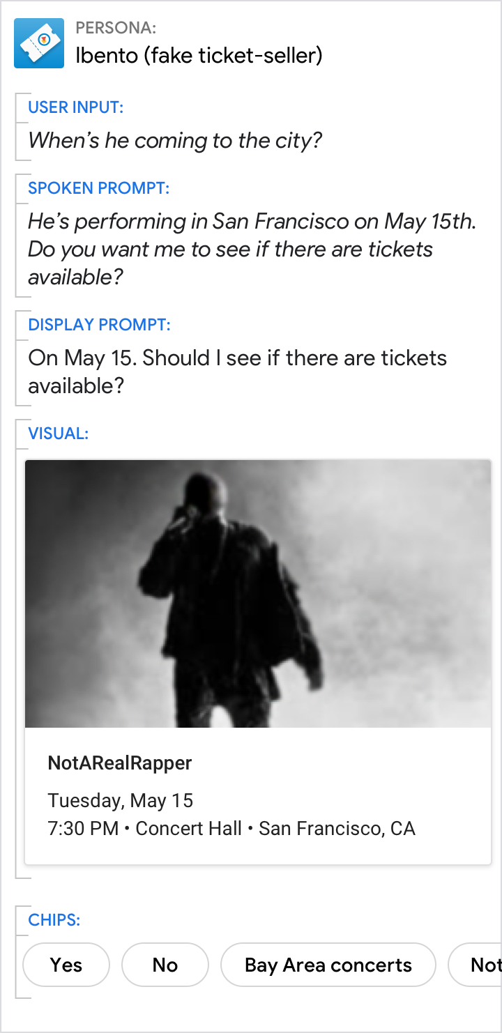
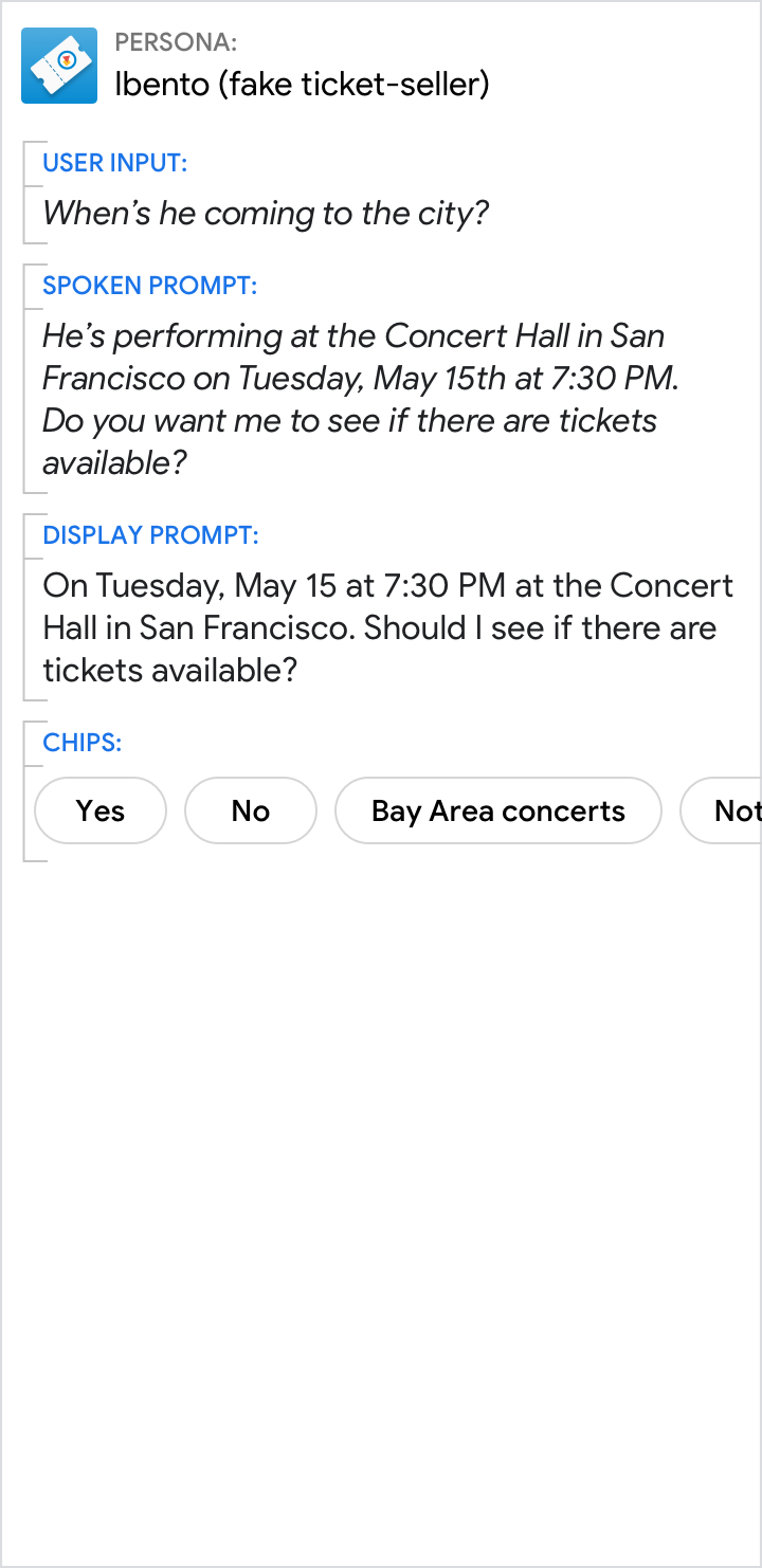
Give the short answer in the prompts and the related details in the card
| Do | Don't |
|---|---|
 |
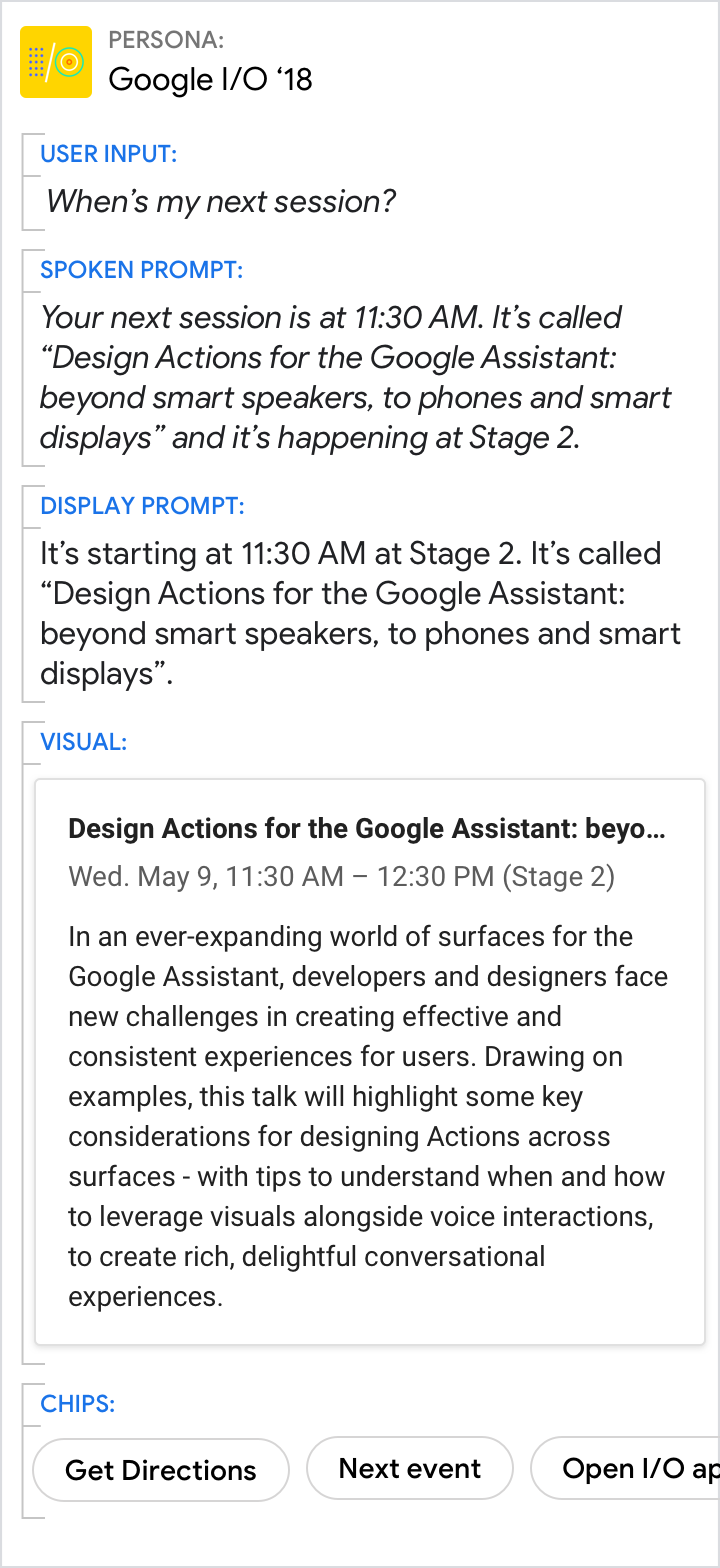 |
| Use the spoken and display prompts to give the specific answer to the user's directed question (11:30 AM in this example). Use the visuals for related details. | Avoid redundancy between the spoken prompt, display prompt, and visuals. |
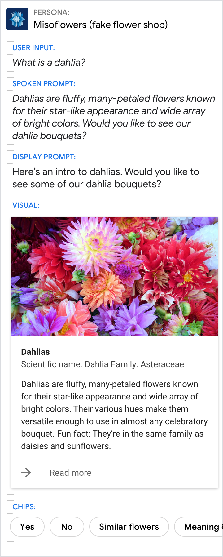
A picture is worth a thousand words
| Do | Don't |
|---|---|
 |
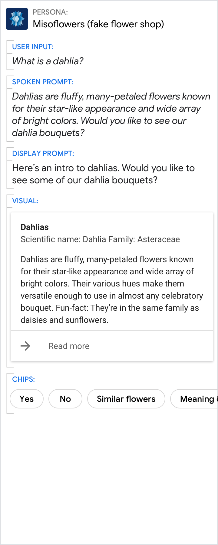 |
| Sometimes an image is the best way to convey information to the user. | Though the description is nice, a picture would have been better. |