Understanding this type of conversational component will help you give users
information in a clear and concise way.
Overviews
Overviews (also called introductions, headers, preambles, or advance organizers)
set expectations about how information will be structured. They set up mental
"compartments" in which the user can receive the incoming information, thereby
reducing cognitive load.
| Do |
Don't |
 |
 |
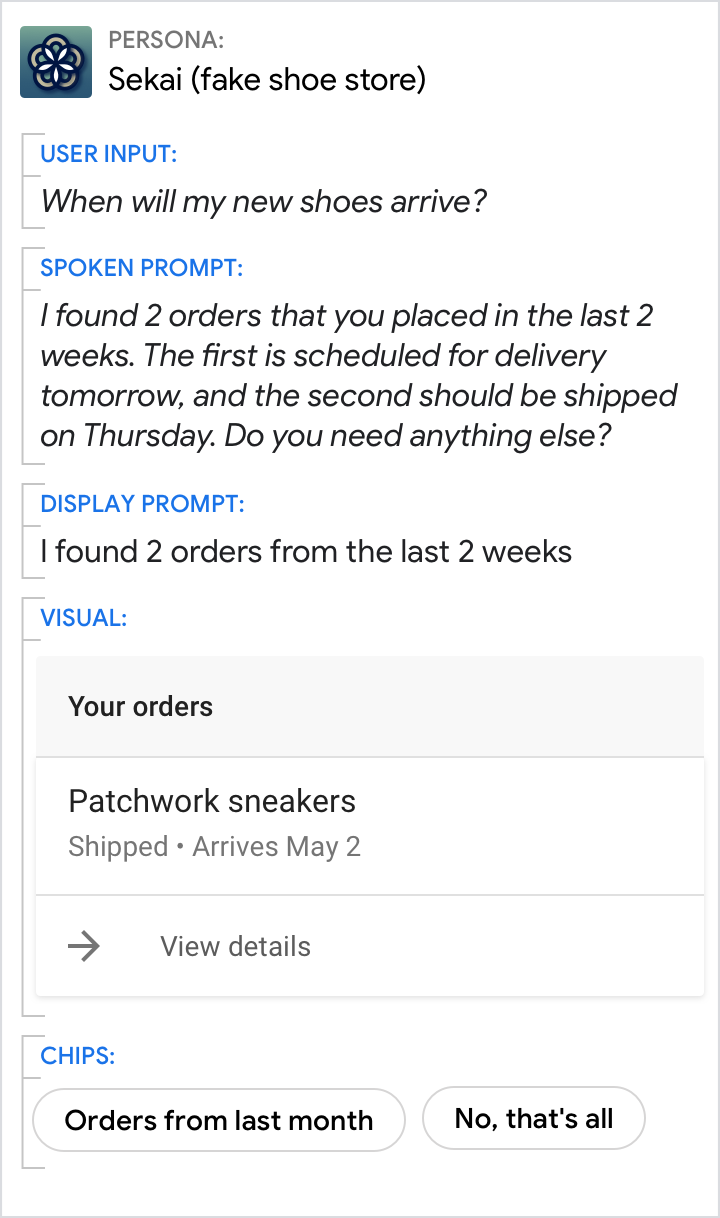
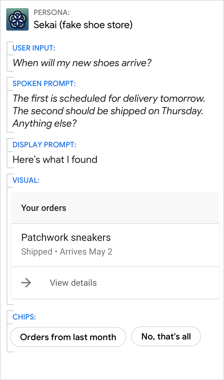
| Set user expectations about the information they're getting. Here, the search window was 2 weeks, and 2 orders were found. |
Don't surprise the user with multiple results off the bat. Don't use a vague introduction ("Here's what I found") when a specific one would provide more value to the user (e.g., the length of the list, search criteria). |
Users will have lots of questions for your persona, so use informational
statements to provide clear and concise answers. Focus on the essential, or
core, information that's most relevant to the user's query. More peripheral
details should be presented in the visuals instead or omitted entirely. It's
okay to include additional information that the user didn't specifically ask for
as long as it's highly relevant to their query.
- Spoken prompts should lead with an implicit confirmation
of the information that was said or implied, followed by the new information.
This is because spoken English places the most important information (e.g.,
the answer) at the end of the sentence; this is known as the End-Focus
Principle.
- Most of the time, the display prompt is used to point to more detailed
information in the accompanying visuals. When there are no accompanying
visuals, it's acceptable to use the same verbiage for the spoken and display
prompts. However, you should condense the information in the display prompt to
make it easier to scan.
- Chips should include ways the user can continue the conversation with your
persona. Try to offer actions the user could take with this information or
related information they might be interested in.
| Do |
Don't |
 |
 |
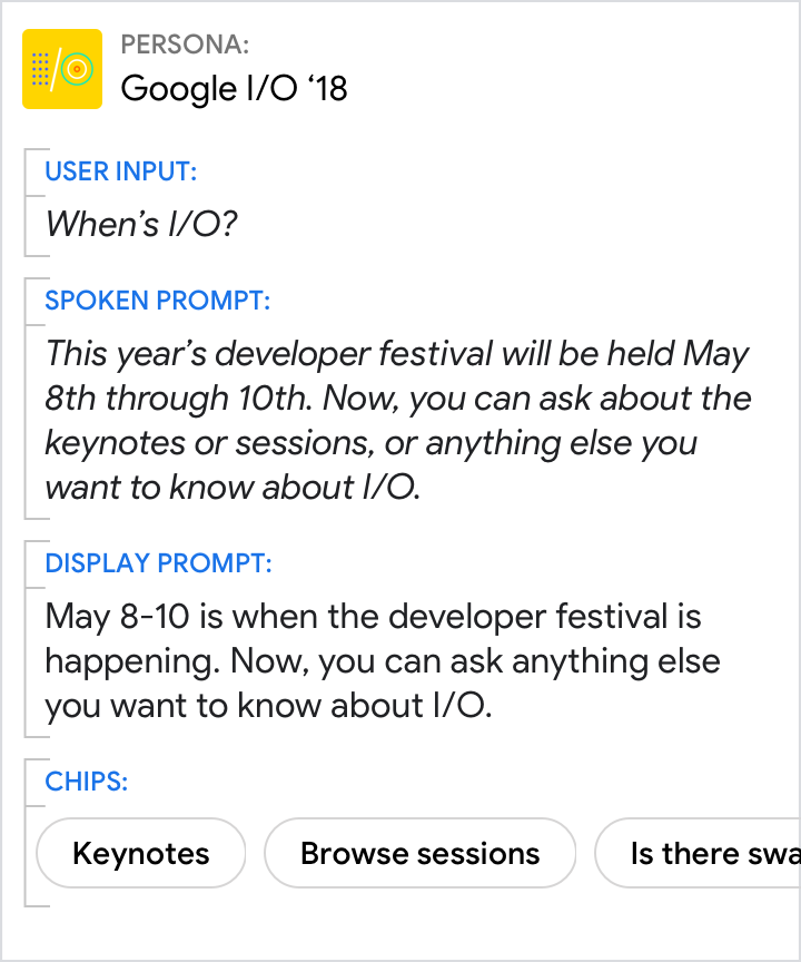
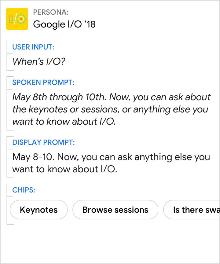
| Use implicit confirmations ("...this year's developer festival...") to carry the thread of the conversation forward by maintaining context. Note that the spoken prompts use end-focus, while the display prompts front-load key info for scannability. |
Don't provide the answer without the context. |
| Do |
Don't |
 |
 |
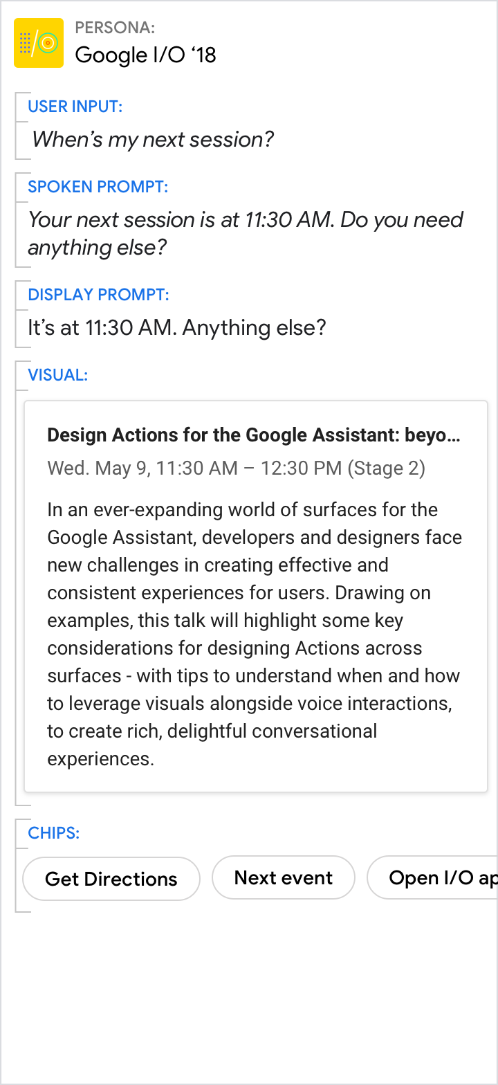
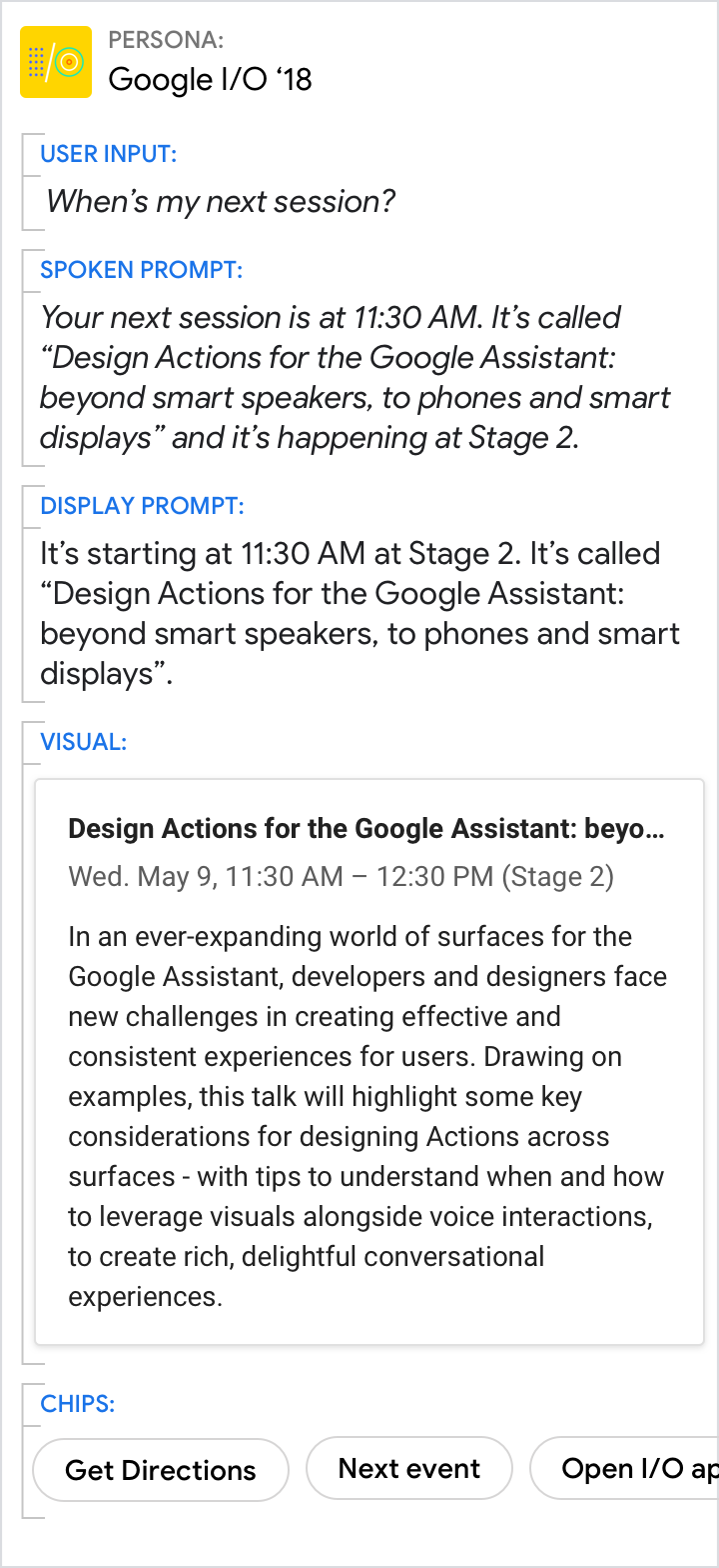
| Use the spoken and display prompts to give the specific answer to the user's directed question (11:30 AM in this example). Use the visuals for related details. |
Avoid redundancy between the spoken prompt, display prompt, and visuals. |
Even when the visuals provide the best answer, make sure the prompts still carry the core of the message
| Do |
Don't |
 |
 |
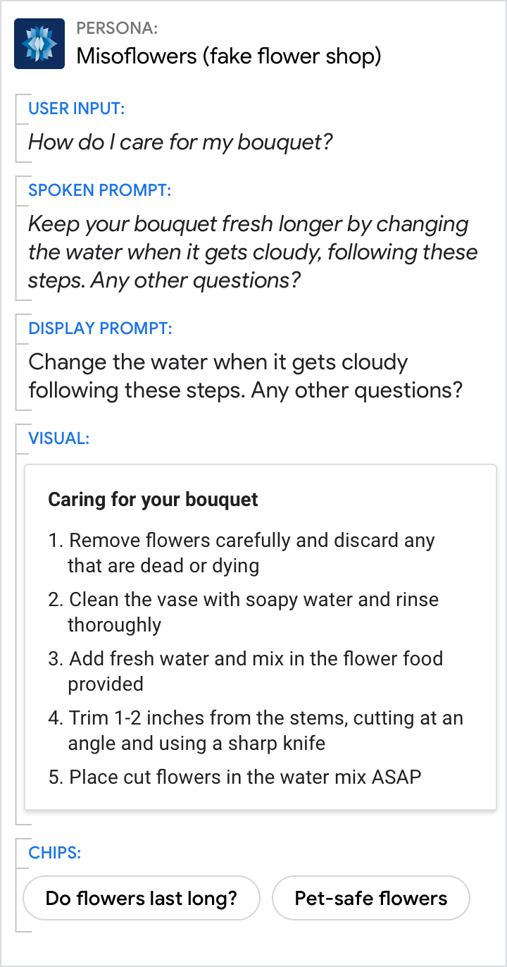
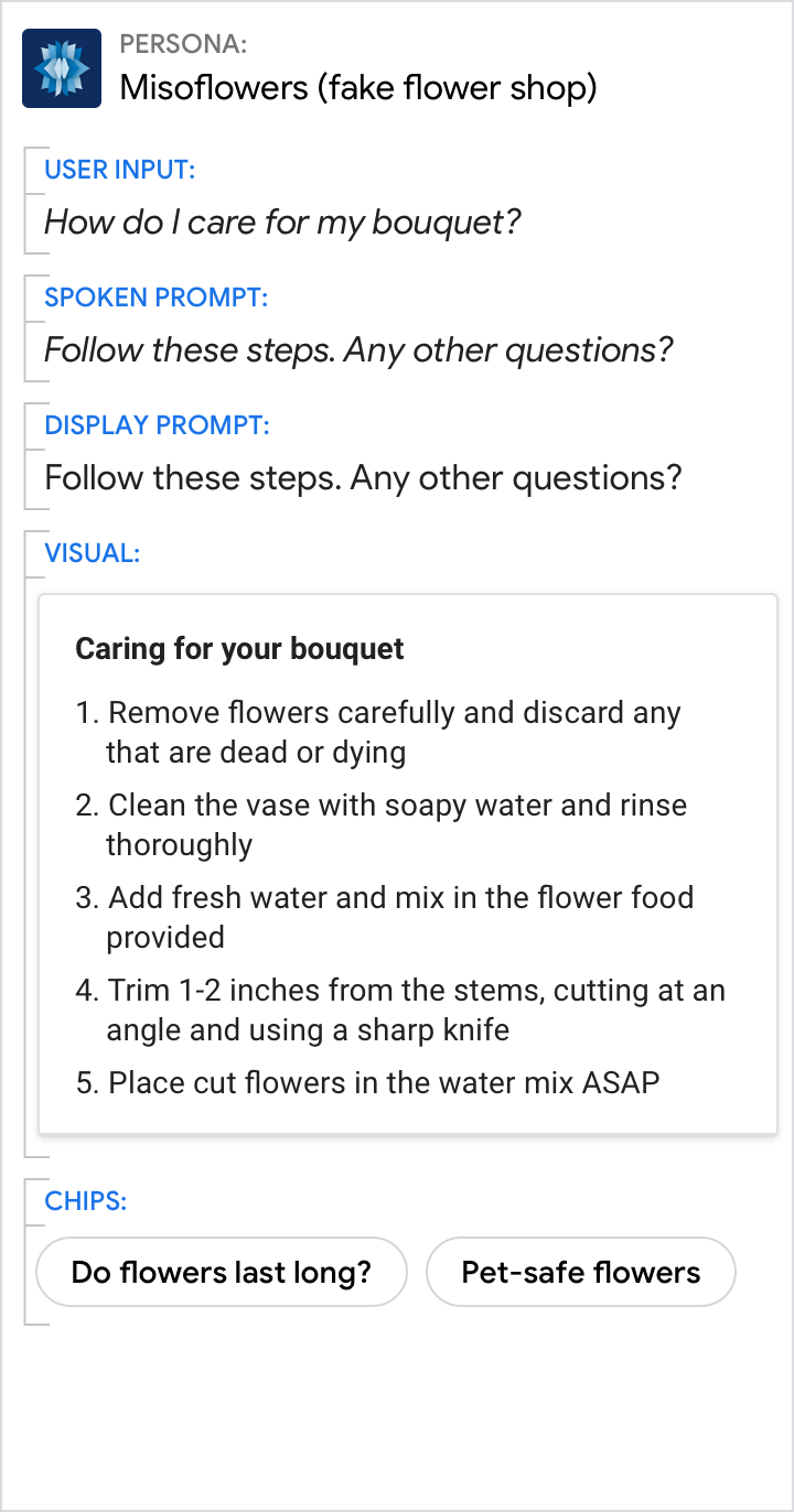
| Use the prompts to give an overview. Use the visuals to provide additional detail. |
Don't force the reader to scan and read. Your persona should reduce the work the user needs to do, which includes the effort of scanning through detailed information. |
| Do |
Don't |
 |
 |
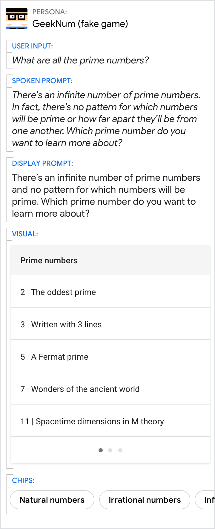
| Some facts about prime numbers in general are relevant to the user here, above and beyond a list of prime numbers. |
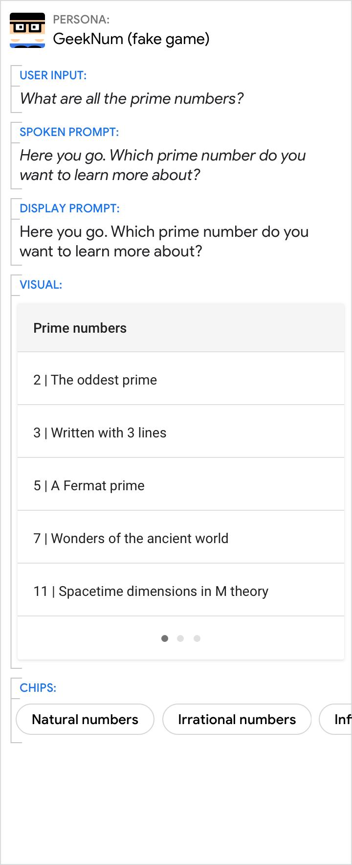
Here, the persona misses an opportunity to share relevant facts. |
| Do |
Don't |
 |
 |
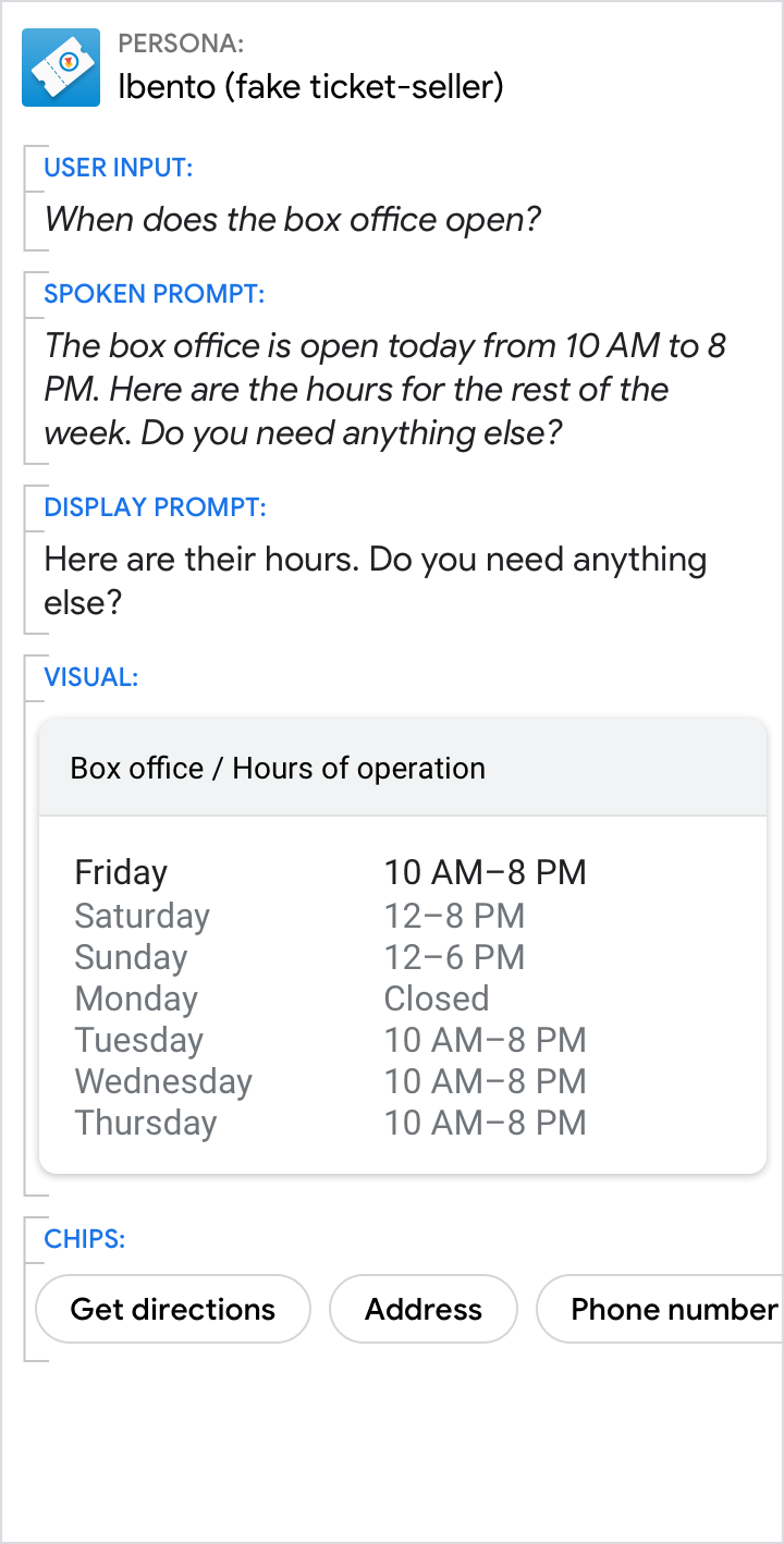
| Keep informational statements concise by including only the most relevant information (e.g., today's hours). Use the visuals to provide additional detail. |
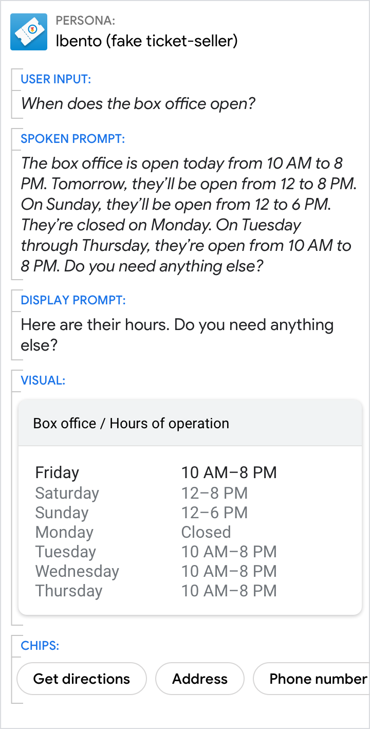
Don't overwhelm the user by putting lots of information in the spoken and display prompts. Instead, leverage the visuals. |
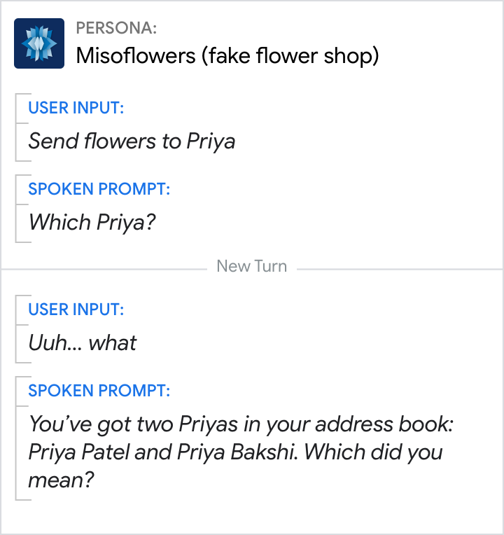
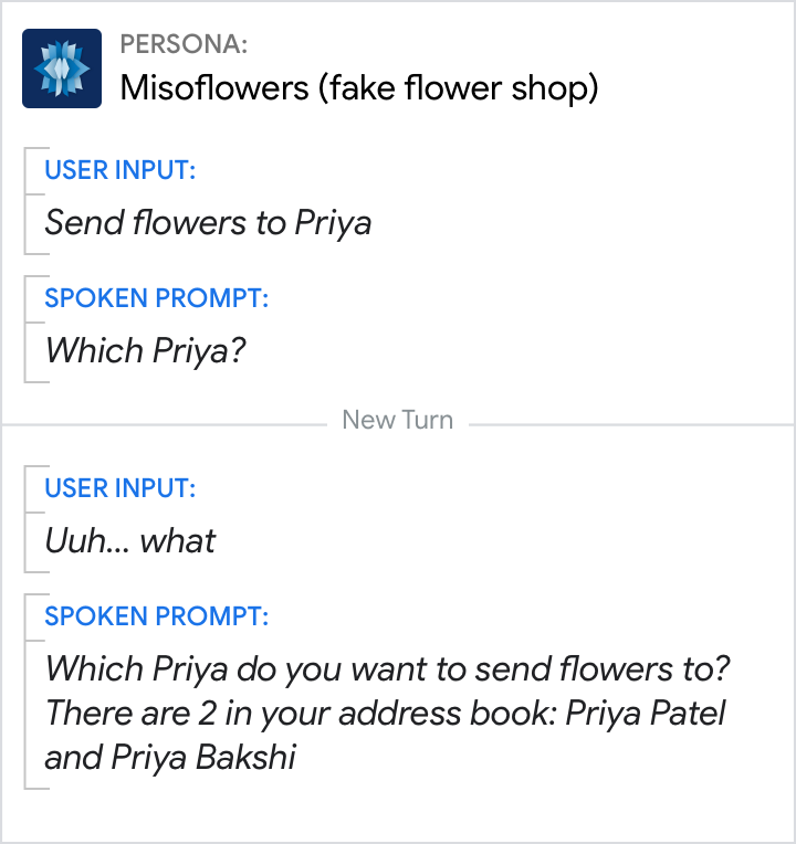
Your persona can present the user with a menu or list of options.
In this example, a narrow-focus question is used for disambiguation.
| Do |
Don't |
 |
 |
| If the user requires information before making a choice, provide the information first, then ask the question. (Or use phrasing like "which of these...") |
Don't ask a question and then keep speaking. See turn-taking. |
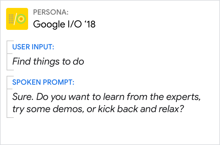
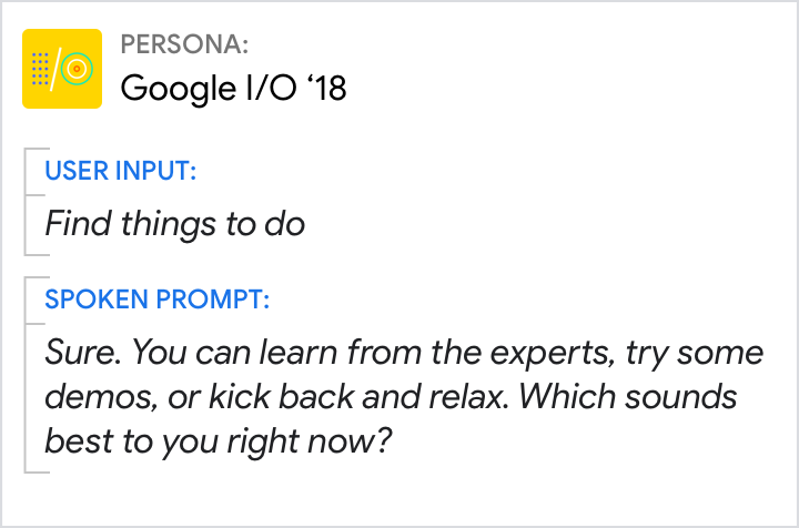
In this example, a narrow-focus question is used for disambiguation.
| Do |
Don't |
 |
 |
| A question can include a menu as long as the options are short and few. This narrows the question's focus and makes it easier for the user to understand. |
There are only a few options, they're not wordy, and this is a familiar, intuitive question—so it feels heavy and robotic to split them into separate sentences. |
